

I Analysed 1,000 of My Own LinkedIn Posts. Here Is What Actually Drove Engagement.
LinkedIn engagement, reverse-engineered: what a thousand posts reveal about format, angle, hooks and timing.

A lot of senior professionals tell me the same thing: That they post on LinkedIn, very little happens, and they cannot work out why. I hear it from lawyers, advisers and wealth managers most weeks.
People are reporting far fewer impressions than they were gaining 18 months to two years ago. This has affected most people, including me.
An honest starting point. I have posted consistently for years, which is the only reason this was possible. A large archive is what makes a real analysis worth doing.
I exported 1,000 of my own LinkedIn posts and reverse-engineered the winners by format, angle, hook and timing. Image posts beat everything.
Text-only is where engagement goes to fade.
Personal story was my strongest angle by a clear margin, ahead of the contrarian take. The posts in the 901 to 1,200 character band performed best. Saturday and 21:00 London time were my strongest slots.
Below is the full breakdown, with my own top posts as the evidence, and a playbook you can run for your own account.
I spend my working life telling senior professionals how to use LinkedIn well. So it felt only fair to hold my own account to the same standard, with data rather than instinct.
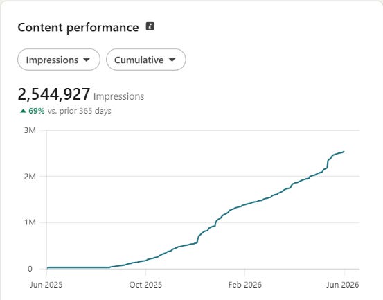
I exported the file and handed it to Claude. I asked it to compare my strongest posts with my weakest, and to tell me what actually separated them, by format, angle, hook, length and timing.
Some of it confirmed what I coach every day. Some of it made me look again at habits I had defended for years.
I reverse-engineered the top performers using a simple rule, taking the posts that beat three times my median engagement and asking what they had in common.
Some of it confirmed what I already coach. Some of it made me look again at habits I had defended for years.
A quick aside before the findings. Running this analysis is one thing. Acting on it every week, with the right format, angle and hook, is where most senior professionals run out of time. That is the part my team handles through the Link Tank Luminaries programme, a done-for-you LinkedIn content and growth service. If writing the posts yourself is the bottleneck, that is where we come in.

Here are the findings that stood out, with my own posts as the evidence, followed by a playbook at the end.
The findings that stood out
Here is what the top of that archive looks like:
1,000 posts analysed in a single file.
The standout posts each beat three times my median engagement, which is the rule I used to separate the genuine winners from the rest.
My single best post reached 1,842 engagements.
The strongest length band, 901 to 1,200 characters, averaged 107.6 engagements.
Images carried almost every winner. Image posts were my top format by both average and median engagement. Carousel and document posts sat close behind and remain underused enough that I should be testing them far more often than I do. Text-only posts were consistently at the lower end. The lesson is uncomfortable for anyone who likes writing.
On this account, the words do better work when a visual is doing the first job of stopping the reader.
Insights from my top-performing posts
Three posts stood out. Here is what made each one work.
The milestone story
(”I’m 50 today”, 1,842 engagements). A personal post marking my fiftieth birthday, written as a reflection rather than a sales pitch.
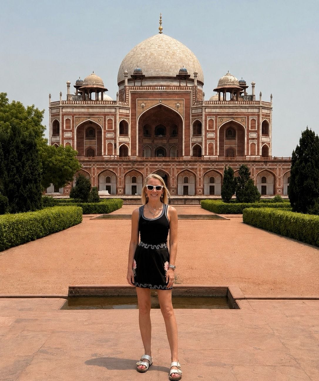
Why it worked: It was personal, specific and honest from the first line. People saw something of themselves in it.
Lesson: A real personal moment, told plainly, travels far further than any tactical post.
To apply this: When you reach a genuine milestone or turning point, write it as a short first-person story rather than a humblebrag.
The consistency story
(”3 years ago, I was posting when I felt inspired”, 817 engagements). A post about the shift from posting on a whim to posting with intent.
Why it worked: It named a habit my audience recognises in themselves, then showed what changed. It sat squarely in my niche, so the people it reached were the right ones.
Lesson: A story about your own change persuades more than advice handed down from above.
To apply this: Take one thing you used to get wrong, and show the before and after honestly.
The news reaction
(”Quite frankly, I’m disappointed”, 1,576 engagements). A reaction to something in the industry, with a clear point of view.
Why it worked: A strong opening, real feeling, and a clear position for readers to agree or disagree with.
Downside: It is the exception in my data. News reactions are hard to repeat on demand, and they gather people around a moment rather than around what I actually do.
To apply this: Use a news reaction when you genuinely hold a view, and do not build your week around it.
The pattern underneath all three is the same. A specific first line, a real point of view, and a personal frame.
On LinkedIn, the format earns the attention and the first line earns the read.
Comparative analysis: strong posts against weak ones
I asked Claude to set my high-engagement posts against my low-engagement ones and describe the difference. The split was consistent.
The strong posts:
led with a visual, usually an image or a carousel
opened with a personal story or a clear point of view
carried one idea, stated specifically in the first line
closed with a question a busy professional could answer quickly
The weak posts:
were text-only, with no visual to stop the reader
opened with a vague observation or a general reaction to industry news
tried to cover several ideas at once
ended flatly, with nothing to respond to
One angle broke the pattern. A post that opened with “Quite frankly, I’m disappointed” reached 1,576 engagements, and it was a news reaction rather than a personal story. It is the exception worth noting. The repeatable signal in the data is personal story, so I treat a strong news reaction as an opportunistic extra rather than something to build a week around.
There is a length band that wins. The highest-performing posts sat in the 901 to 1,200 character range, averaging 107.6 engagements. That gives a clean working rule.
Write enough to deliver real substance, then cut anything that does not strengthen the story, the argument or the closing question.
Timing mattered more than I expected. Saturday was my best day by average engagement, and 21:00 London time was my best-performing hour in the file. I would not plan a routine update around that. I would hold those slots for the posts that matter most commercially.
The playbook: how to build the next post
Run these in order. Each step is drawn straight from what the top posts had in common.
1. Lead with a visual.
Default to an image post when speed matters, and a carousel or document post when the idea needs sequencing or a framework. Reserve text-only for something genuinely time-sensitive that cannot support a visual. The visual is the format doing the heavy work of earning attention, so it is the first decision, not the last.
2. Pick a proven angle.
Choose a personal story first, for a lesson, a client pattern, a mistake, or a perspective earned through experience. Choose the constructive contrarian take second, for correcting bad advice or reframing what works for regulated professionals. Choose a how-to or framework third, which is still worth building volume in before treating it as a core pillar. Avoid opening with a vague observation or a generic reaction to industry news unless there is a clear strategic reason.
3. Open with a specific hook.
The strongest posts open with specificity, tension, or a promised outcome. Three formulas do most of the work.
❌ Some thoughts on staying visible at work
✅ I learned this the hard way when a client almost left over one post.
❌ Here is my take on personal branding
✅ Everyone tells lawyers to post more. For most senior partners, that is wrong.
❌ A few tips on writing better updates
✅ 3 ways to stay visible on LinkedIn without sounding like a salesperson.
4. Make the visual carry the hook.
The asset should repeat the hook, not introduce a different idea. Keep it legible on mobile, and branded without looking like a brochure. For a single image, use three layers. The top line is the shortest version of the hook. The middle states the benefit or the tension in one sentence. The bottom carries a small brand device or a face to keep it human. The principle is clarity over complexity. One idea, one promise, one visual hierarchy.
5. Structure the caption to do four jobs.
Open by sharpening the hook in the first line. Add a short block of story, proof or context. Deliver the lesson, the steps or the perspective cleanly. Close with a question a busy professional can answer in one line. Keep it skimmable on mobile, with short paragraphs rather than dense blocks.
6. Aim for 901 to 1,200 characters.
This was the strongest band in the data. It is long enough to say something that matters and short enough to respect the reader’s time. If a line does not strengthen the story, the argument or the call to action, cut it.
7. Publish in a strong slot when it counts.
Saturday and 21:00 London time were my best windows. Hold those for the posts with real commercial or strategic weight, rather than filling them with routine content.
A sensible weekly rhythm follows from all of this. Two image posts, one personal proof point and one constructive contrarian take. One carousel or document post built around a framework or a lesson sequence. One optional fourth post, only when there is a genuinely timely angle worth the slot.
How to run this analysis yourself
You can reproduce this on your own account in an afternoon. You need a way to export your post data, and then Claude to find the patterns.
Step 1: Export your post data
There are two routes, and they carry different levels of risk.
The lower-risk route is an approved analytics tool or LinkedIn itself. AuthoredUp connects to your account and lets you export your posts, with their engagement, format and dates, to a CSV file.
LinkedIn also lets you download a copy of your own data and export analytics for your posts from the creator analytics area.
Both keep you within LinkedIn’s terms, because you are only ever working with your own posts.
The faster route is a scraping tool such as Apify. Create a free account, find a LinkedIn post scraper in the Apify Store, paste in your profile URL, set how many posts to collect, then export the results as CSV or Excel. This will pull a large archive in minutes. (Use it at your own risk. LinkedIn’s User Agreement restricts automated scraping, and while these tools describe themselves as compliant on the basis that they only gather public data, that is the vendor’s position rather than a settled legal one. Weigh that up before you decide.)
Whichever route you choose, the goal is a single file that lists, for each post, the text, the opening line, the reactions and comments, the format, and the date and time it went out. That is everything the analysis needs.
Step 2: Hand the file to Claude
Upload the file to Claude or Perplexity, then give it this brief. It works in either tool and produces the analysis behind this article. The evidence rules at the top are what stop it from inventing patterns or guessing at what your images showed.
You are analysing my LinkedIn posting history to work out what
actually drives engagement on my account, and to turn that into a
repeatable recipe for my next post.

I have attached an export of my own LinkedIn posts. Treat this file
as your only source. Work from the fields it genuinely contains,
such as post text, engagement counts, post type, links and
timestamps.

Evidence rules, follow these strictly:
- Use only what the export supports. Do not invent figures, posts
  or patterns.
- The export does not include the contents of images, carousels or
  documents. Do not describe or assume what those visuals showed.
  Classify a post's format only from the export's own type field.
- Where you infer the angle or hook style from the post text, label
  it as inferred rather than confirmed.
- Where a pattern rests on only a handful of posts, say so and treat
  it as tentative.
- If two fields appear to conflict, flag it rather than choosing
  silently.

Analysis, in this order:
1. Calculate my median engagement across all posts, and state how
   engagement is measured in the file.
2. Identify my standout posts with a clear rule: every post that beat
   three times the median. Say how many qualified.
3. For those standout posts, find what they share across: format
   (image, carousel or document, text-only), angle (personal story,
   constructive contrarian take, how-to or framework, news reaction),
   opening hook style, character length, day of week, and hour of day.
4. Report the best-performing character length band, with its average
   engagement.
5. Report my strongest day and hour, with the caveat that timing is a
   weak signal unless the gap is large.
6. Give up to five worked examples from my real top posts. For each,
   include engagement, format, angle, the opening line, and the post
   link from the export.

Then produce a step-by-step recipe for my next post, covering:
which format to choose and when, which angle to lead with in priority
order, two or three hook templates drawn from what worked, how the
visual should relate to the hook, a caption structure, a target length
range, the best time to publish important posts, a sensible weekly
posting mix, a short pre-publish checklist, and a short list of what to
stop doing based on the lowest performers.

Close with one line on what this analysis can and cannot show, given
it rests only on the export's data.
Step 3: Pressure-test what it gives you
Ask Claude to show its working. Which posts cleared the three times median line, and what the counts were. Sense-check the result against what you remember posting. Watch for patterns built on small samples, because a format that only appears a handful of times can look stronger than it really is. The point is to find your own format, your own angle and your own hook style, not to borrow mine.
Then run a short quality check before anything goes live. Confirm the format is visual unless there is a strong reason it cannot be. Confirm the first line creates tension, specificity or a promised outcome. Confirm the angle is clearly a personal story, a constructive contrarian take, or a practical framework. Confirm the visual repeats the hook. Confirm the final line asks for a response a busy professional can give quickly.
Over to you
None of this rescues a post with nothing to say. The format earns the attention. The hook earns the read. What the data does is stop you handing engagement away through habit, before the writing has had a chance to work.
If you run this on your own account, I would like to know which angle proves strongest. Tell me in the comments.
Melanie
This article is based on an analysis of 1,000 of my own historical LinkedIn posts. It draws only on what the export could support directly, meaning engagement, post text, hooks, links, timestamps and derived format and angle performance. The image and slide content could not be inspected from the data, so the findings describe what worked on my account rather than universal rules. Treat them as strong signals to test against your own numbers.
"Saturday and 21:00 London time were my best windows." Any thoughts on why Saturday (as opposed to a weekday where one could assume that there are more readers logged in to LinkedIn) was stronger than other days?
Great insights thanks for the share!